TPS | Telecom Power Solutions
About
Telecom Power Solution (TPS) is a company specializing in telecommunications infrastructure services, including installation and maintenance of telecom stations. The company works with large-scale enterprises and aims to expand its presence beyond the local market into international territories.
Deliverables
Logo Design
Visual Direction
Brand Applications
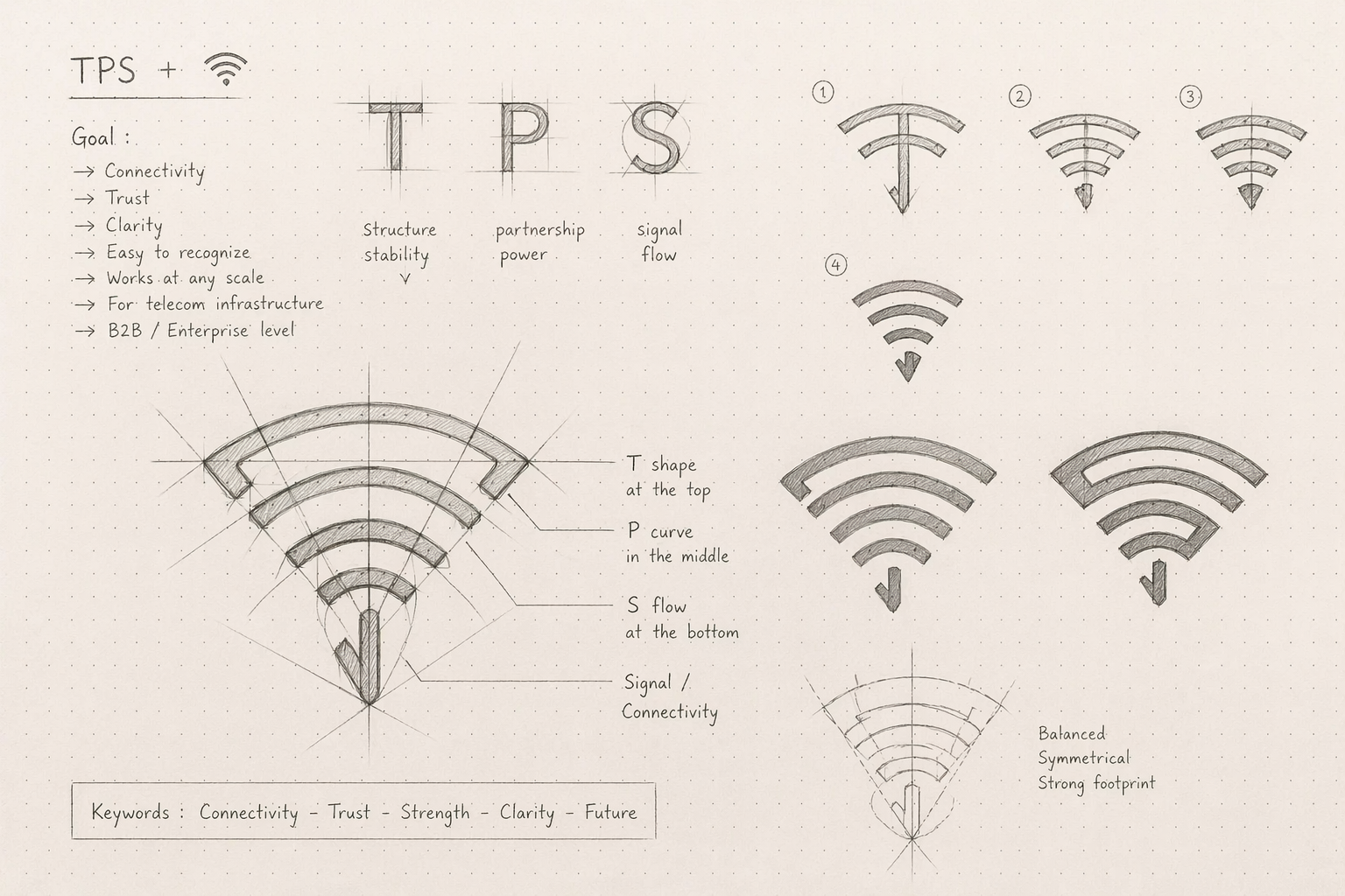
Challenge
In a highly competitive B2B telecom space, TPS needed a logo that feels clear, trustworthy, and instantly recognizable.
The real challenge was simple but critical:
How do we turn three letters (T, P, S) into a distinctive mark that stands out, without overcomplicating it?
The Idea
We transformed the initials into a WiFi signal—a universal symbol of connectivity.
A clean, geometric construction ensures clarity at every scale, while the form itself directly reflects the industry.
The blue–green gradient bridges technology and energy, reinforcing both trust and forward momentum.

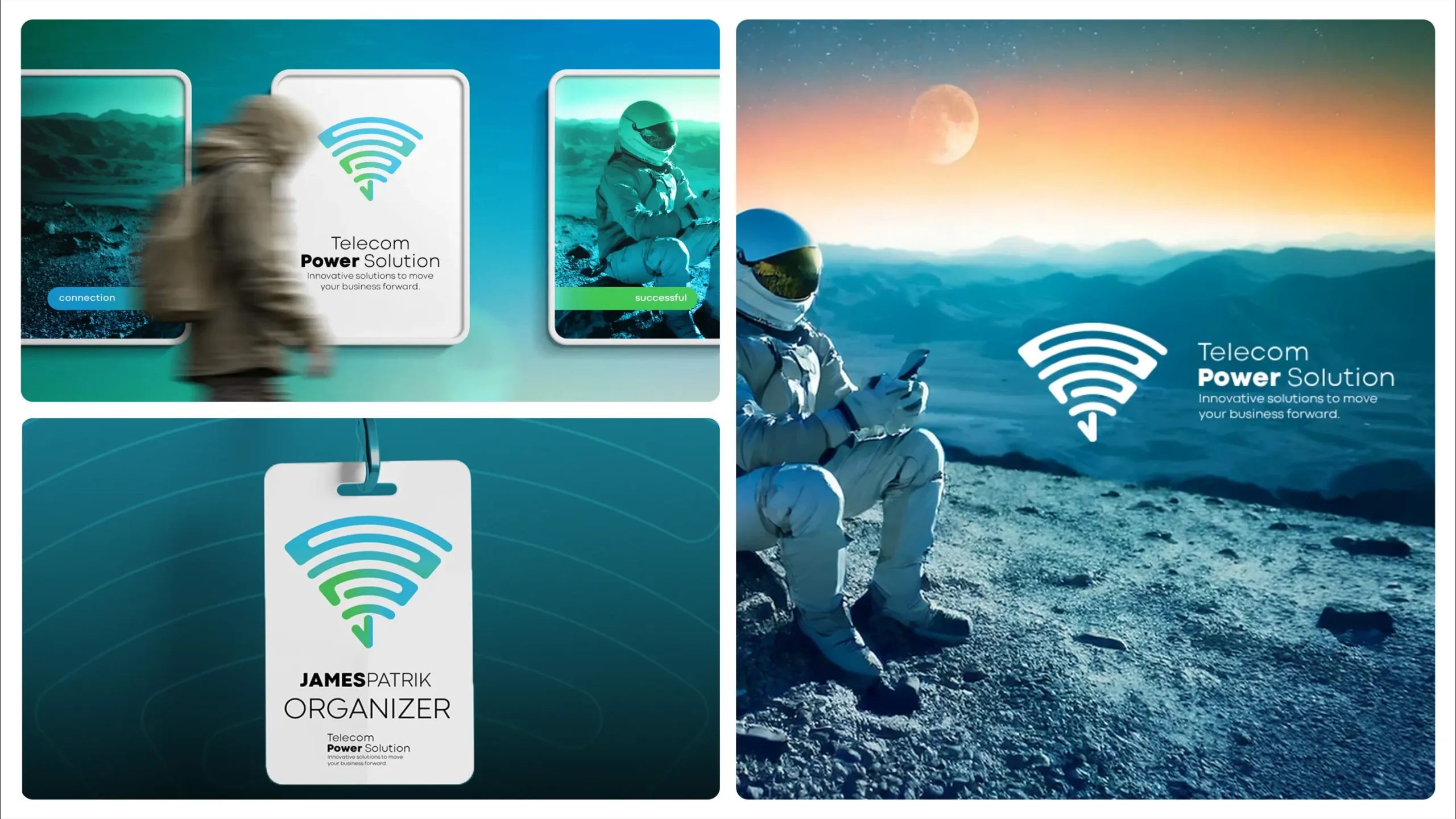
The Result
A bold, minimal mark that is easy to recognize and built to scale.
The identity positions TPS as a reliable and forward-looking partner, ready to operate among major players and expand into new markets.